January - February 2023
Cardiff University- Individual Project
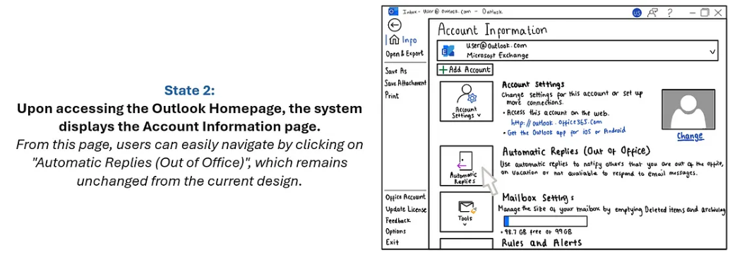
Redesigning Microsoft Office AUTOMATic REPLIES FEATUREThis project focuses on improving the functionality of Microsoft Outlook's Automatic Replies feature. Currently, users can only establish a continuous time frame for replies, limiting customization options. The objective is to redesign the interface, enabling users to set replies for specific dates, days of the week, and working hours. By providing users with greater flexibility in managing automatic replies, the project aims to enhance user experience and productivity within the application.

I first started off with the empathise phase of the design process to define user goals.

Persona 1- Primary Persona
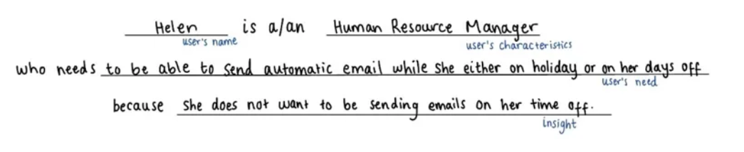
Name: Helen Steven
Age: 36
Occupation: Head of Human Resourses
“I want to be able to send automatic replies to emails when I will not be able to reply to emails. This includes my days off and holidays”
Helen Steven is the Head of Human Resources at a law firm, overseeing all aspects of HR operations including recruitment, performance management, and benefits administration. She seeks a solution that empowers her to efficiently manage automatic email replies with personalized messages and flexible scheduling options. The redesigned Automatic Replies function will enhance her productivity and contribute to a more seamless workflow.
Understanding and create profile users:
Key goals:
Helen wants to optimize her time by automating routine tasks such as setting up automatic email replies.
She seeks to customize her automatic email replies based on the recipient and context, ensuring a tailored and professional response.
Schedule automatic replies for specific dates, days of the week, and hours, allowing for greater customization and control.
Frustrations:
Helen finds the current Automatic Replies function in Microsoft Outlook restrictive, especially in terms of specifying different messages for different recipients and time frames.
Problem Statement:
Next, I created a problem statement. This allowed me to have clarity of the user goals, identify constraints and allowed me to measure the success of the application in achieving these goals.
“If Helen utilizes the new Automated Replies function, then she can efficiently manage her email communication, tailoring responses to different recipients and contexts.”
Task Analysis:
After understanding the user’s needs and preferences, the next step in the process was task analysis. This involved assessing the popularity of each task based on the number of users engaging with it and the frequency of its occurrence. This method ensured that our focus remained on addressing the most performed and impactful tasks to enhance the usability.

Critical Task-
Based on the analysis, the two main use cases are:
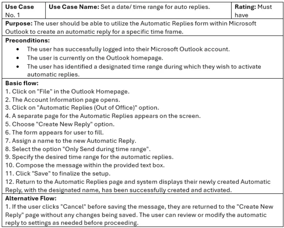
1) Set a date/ time range for auto replies.
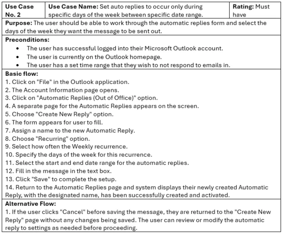
2) Set auto replies to occur only during specific days of the week between specific date range.
Use Cases-
State Transition Network for Basic Flow Use Case 2-

Designing-
When designing the interface, I leveraged Microsoft’s classic styling to capitalize on familiarity, thereby enhancing effectiveness and satisfaction. By integrating familiar design elements such as colour schemes, typography, and layout patterns, users navigate the interface with ease and confidence. This consistency across Microsoft products fosters a cohesive experience, reducing the learning curve and fostering trust and reliability.
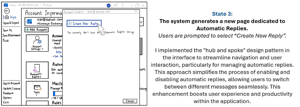
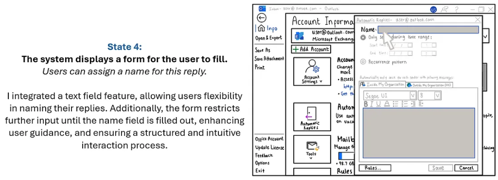
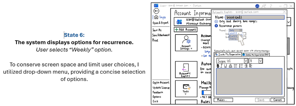
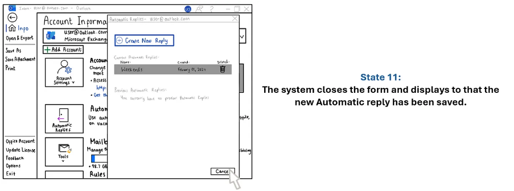
Additionally, I employed two key design patterns, Progressive Disclosure and Wizards/Tunnels, to enhance usability and user experience. Progressive Disclosure gradually reveals information, minimizing cognitive overload and promoting comprehension. Wizards and Tunnels structure the setup of automatic replies into clear steps, simplifying complex processes and fostering user engagement. Together, these design strategies elevate user satisfaction and streamline the overall user experience.
As shown below, I also applied Robin Williams’s CARP principles to enhance visual design and usability:
Contrast

By strategically manipulating white space, selecting appropriate colours, and positioning elements thoughtfully, I achieved effective contrast. I tested my contrasted by blurring the interface. I discovered that users found the message entry field remarkably clear, especially when contrasted with the background. The inclusion of the colour blue not only improved clarity but also added visual interest to the form.
Alignment-

To ensure a clean and sophisticated interface, I implemented the principle of alignment. This allowed me to unify and organize the screen elements seamlessly. To test the effectiveness of alignment, I drew lines down the interface to ensure that elements were appropriately lined up, improving the overall user experience by providing a sense of order and coherence.
Repetition-
In my design, I leveraged Microsoft’s classic blue colour palette and maintained consistency by using the same font throughout. This repetition strategy enabled me to establish a coherent and uniform appearance across the interface. I achieved visual harmony and reinforced brand identity, fostering a sense of familiarity and reliability for users interacting with the interface.
Proximity-
I also employed the principle of proximity in my design strategy. By grouping related elements and placing them near one another, I created visual relationships that guided users’ attention and simplified navigation.


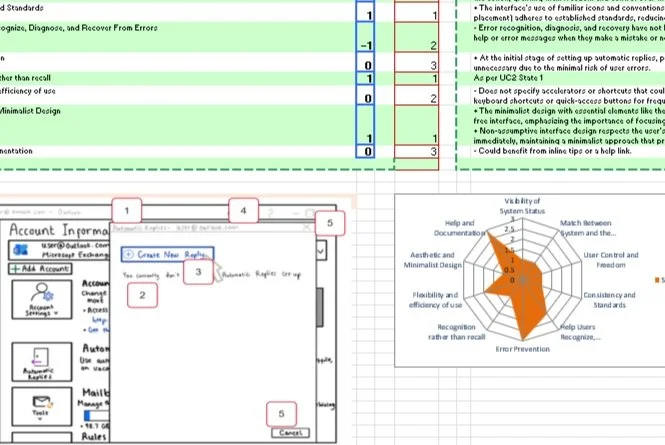
Heuristic evaluation:
I then perform a heuristic evaluation on the interface states, identifying all usability features and issues. The report includes:
a. Usability Problems: Detail each issue, its severity, and suggestions for improvement.
b. Good Design Features: Outline effective design elements to retain in future revisions.